Every NHL Team's Best Jersey from the 2023-24 Season
April 4, 2024Every NHL Team's Best Jersey from the 2023-24 Season

We've seen every NHL team decked out in various jerseys this season, between the home and away standards to the various alternates and special occasion shirts, and we're going to pick every team's best one. You might think this is easy, but trust us, it isn't.
We're approaching the end of the regular season and eagerly anticipating the start of the playoffs. And while we wait to see how everything shakes out, we wanted to occupy our time with the time-honored tradition of enraging you with our opinions.
Some teams have a ton of great options, which makes it difficult to pick the best of the bunch; while others don't have any good options whatsoever. We've made the task a little easier on ourselves by not ranking them, but we are picking the best from each team.
Join us on this fashion tour across the league and let us know in the comments what we did and didn't get right.
Anaheim Ducks

Our choice for the Ducks was basically by default because their home and road set, while slightly better than they used to be, are still really poor.
But the alternate that broke out their old shoulder logo as the center crest, along with the old teal and plum color scheme, is so good. It also makes us all wish they'd just go back to those colors and the original logo.
We'll look past this being another circular logo crest because we know it's paying homage to the beautiful past uniforms they had back in the day. The Ducks bringing back the original style is the one 1990s throwback we'd eagerly welcome.
Arizona Coyotes
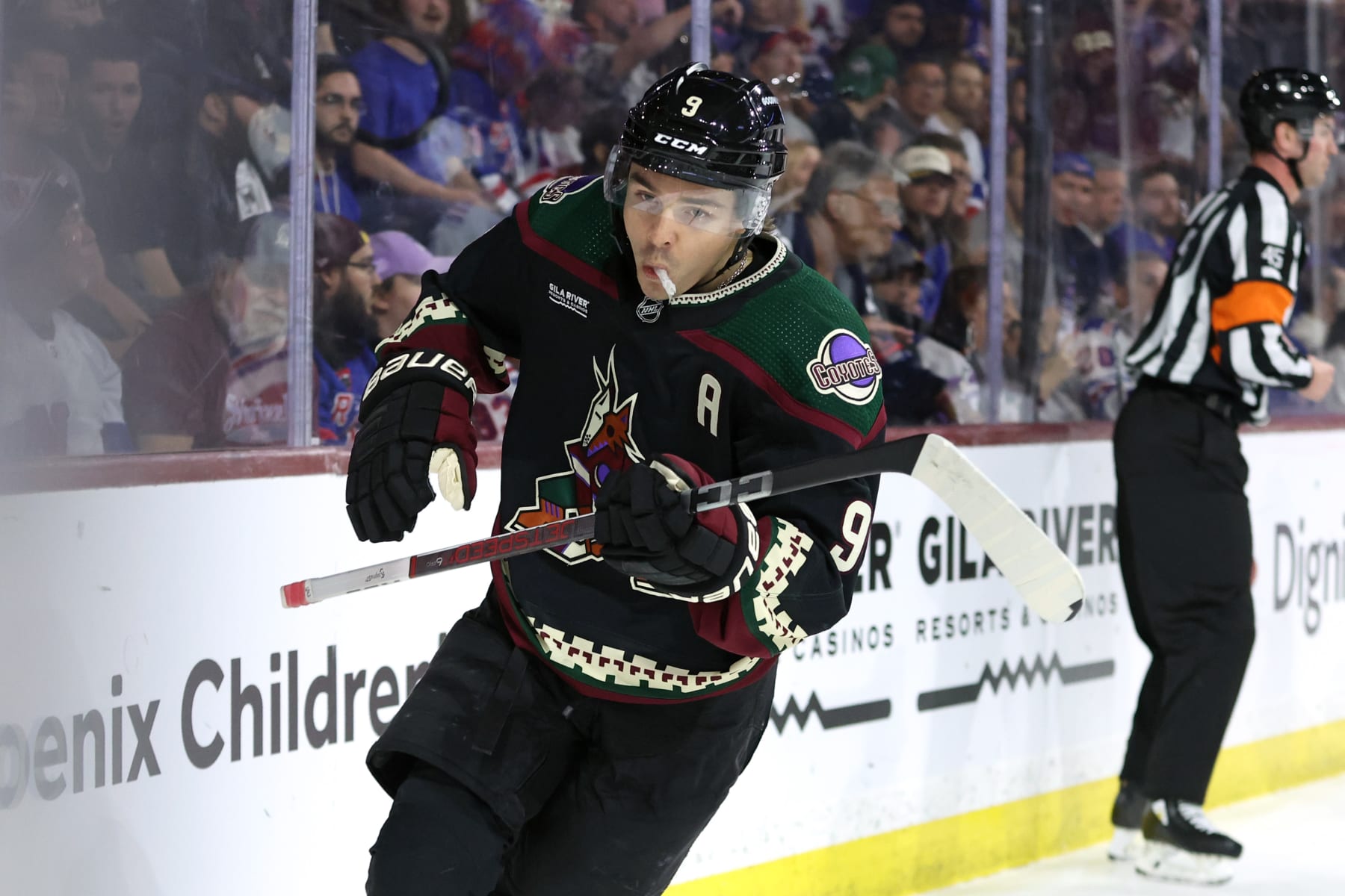
The Coyotes bringing back the Kachina logo full-time was the best idea they've had, and it was difficult to pick between the dark home jersey and the white road jersey because they're both so good.
Although the Coyotes also have a Sonora red alternate with a desert theme to it, it's just fine compared to the beauty of the Kachina. It's unfathomable it was ever changed in the first place, but ownership changes lead to bad ideas sometimes and that's how the 'Yotes got to look boring for so long.
Anyway, we're glad they look as good as they do because it helps distract us from everything else going on with them.
Boston Bruins

Boston's centennial season had them bringing out the classic looks with an extra golden touch. All three of their 100th-anniversary jerseys this season are great.
The home black is smooth, the alternate throwback style jersey reminds us of the Bruins' 2010 Winter Classic style, but it's their road whites that really sing.
Maybe it's because the pale shade of gold works so well against the black and with the white, but it's a bright look that just works superbly.
These aren't the big, bad Bruins of the 1970s, although they occasionally pay tribute to them in their play style, so the home black sweaters don't quite nail it down. The roadies are ideal.
Buffalo Sabres

You could argue that the Buffalo Sabres have the best set of jerseys in the NHL. Their home blues and road whites, which bear a strong resemblance to what the franchise has worn for the majority of its existence, are virtually perfect.
However, the black and red "goat head" jerseys from the 1990s and early 2000s that came back last year had Rasmus Dahlin saying they felt "evil" when they're wearing them.
The jerseys look fantastic, and they sell by the truckload in Buffalo. It also shows that teams can bring back an old look and own it just as hard as their regular fit.
Even though things haven't broken the way the Sabres have wanted on the ice often enough this season, at least they look good out there. Little victories.
Calgary Flames

Any team that plays in one of the NHL's featured events always has a special jersey to wear for it.
In the Calgary Flames' case, they played in the Heritage Classic against their hated rivals in Edmonton, and the throwback-like looks both teams busted out for that event paled in comparison to what they wear throughout the year.
The Flames' home red jerseys are as close to perfect as it gets. They look like they're on fire. The "flaming C" logo is perfect on its own and having that palate to place it on with the jersey makes it one of the best looks in the league.
We know you wanted some controversy and that we'd pick the Heritage Classic jersey somehow, but even we couldn't pretend to be that silly. You don't mess with the best.
Carolina Hurricanes

The Hurricanes are in a weird place in that their current set of jerseys (home, road and alternate) are all kind of...whatever. They're fine, their logo has stayed the same since they moved to North Carolina, but there's no way we're ever picking any of those jerseys so long as they're busting out the Hartford Whalers jerseys, even for one game, each season.
Whalers jerseys are beautiful and iconic, and those are all things Hurricanes jerseys wish they could be. But they won't be. Because the Whalers are the legacy of the brokenhearted and beloved.
The smartest thing the Hurricanes did was paying respect to their history by making sure to make as much throwback merchandise as possible and selling it to fans who have been pining to wear the logo once again. If Carolina can ever create its own logo and uniforms to rival it, it'll really have something cooking.
Until then, we'll always have the Whale, even if it is a weird kind of corporate morbidity to have the Hurricanes wearing the jersey of the team from the city they left so long ago.
Chicago Blackhawks

We're picking Chicago's home red jersey because it's as classic and iconic as it gets. It's a look that hasn't changed in decades and you don't mess with the best.
There are so few jerseys you can recognize from a mile away on sight, but Chicago's is one of them. It's a classic.
That said, though, they should change the logo. It's time.
Colorado Avalanche

Colorado's uniforms are in a strange kind of uncanny valley where they look just enough like the first jerseys they had upon arriving in Denver but they're not quite the same.
It's probably the removal of the color black from the trim that's doing it, but regardless, they're just similar enough to be cool.
However, that slight difference is enough to distract from the road white jersey to make that look not quite as good as the home burgundy and blue sweaters. While we'd love to see the "bigfoot" shoulder logo return someday, the Colorado "C" (a nod to the Colorado Rockies of the 1970s) is pretty nice.
The Avs' alternate is OK, but it doesn't come close to touching the home sweater. It's great.
Columbus Blue Jackets

We really had to twist our own arms here to not pick the Blue Jackets' old-time alternate jersey with the circular logo and a cannon on it. We like that one, but we'd almost like it more if that became the full-time look for a home and road sweater style. Then again, maybe we would like it less seeing it more often.
We struggle with Columbus' uniforms, though. There's so much about the Jackets we really want to like, but something gets in the way. Their home blue jerseys, while befitting of the team nickname, are almost too blue. The alternates are great for a changeup, which leaves us the road whites to give our eyes enough of a break to enjoy the things we do like.
The shoulder logo with the Union soldier cap is neat, the stars on the sleeves are a nice touch, and the crest logo is fine with the flag of Ohio style in it.
But we really want something that grabs us by the collar and makes us love it, and it's not there yet.
Dallas Stars

We're big fans of what the Dallas Stars do for their uniform set. Their home and road jerseys are great, and their "blackout" alternates with neon green involved are extremely cool.
But we're giving our vote to the home "victory green" jerseys. It's tough to resist the road uniforms with the green shoulder yoke and white jersey, but there's something about the full green getup that just works great.
The Stars logo stands out proudly, and the green, white and black just work so well together for a color scheme. Simplifying their style and changing the logo years ago were great moves, and it's paying off now they've got such a great team to watch.
Detroit Red Wings

It's tough to beat a great Original Six look, and Detroit's has gone virtually untouched for so long because it's perfect.
That numerous other teams through history have imitated what the Red Wings do is reason enough to pick out their road white jerseys. Teams at all levels using the same, basic style and trying to mimic the respect the Winged Wheel brings speaks volumes.
If nothing else, though, Detroit's uniforms show that it doesn't take much to make a perfect jersey:
Step 1: Have a perfect logo.
Step 2: Don't have too many colors.
Step 3: Don't use a dumb design.
Step 4: Print money.
Some people prefer the red jersey over the white and that's more a matter of preference. For us, the road white offers a better aesthetic mix and a classic look that spans ages from Gordie Howe to Steve Yzerman to Dylan Larkin. You can't ask for better.
Edmonton Oilers

It's been wild to watch the Oilers try to find something else that could work well enough to both sell a ton of merchandise and allow them to move away from their own incredible history to a modernized style.
But there's no need to do that when it's already perfect. The Oilers logo? Perfect. The whole style of the blue home jersey with the orange yoke outlined in white? Immaculate. The inevitable comparisons of now to players from the Oilers dynasty of the 1980s? Totally unfair unless you're talking about Connor McDavid or Leon Draisaitl.
If the Oilers bust out their all-navy blue alternates for the playoffs again, just pick which round you think they're going to get bounced out of before the Stanley Cup Final. Because that look is haunted and full of bad juju.
Yes, they had their Heritage Classic jerseys as well this season, but... eh. They were OK, I guess. But, again, why mess with the best?
Florida Panthers

It sure would've been cool had the Florida Panthers kept their sky-blue Reverse Retro jerseys from last season as an alternate because it would've made our job so much easier.
Alas, the Panthers only had their red home and white road jerseys this season and while those are fine, it felt like we had it all last year with those Reverse Retros a year ago.
No, we will not let this go.
But since we've got to pick one, we'll go with the Panthers' home reds as the best ones. The red pops and the team logo looks good on it. The Florida state flag-like shoulder/arm logos are fine.
Los Angeles Kings

People have been clamoring for the Los Angeles Kings to do something to change up their current home and road set because it's too plain to belong to a team from Hollywood.
That's why we support the Kings breaking out the 1990s throwbacks with regularity, even with the chrome helmets.
The Wayne Gretzky-era silver and black jerseys are perfect. The Kings logo that comes from their early days and turned silver and black like the football team that used to call L.A. home is just such a perfect look. Bringing that back and making the silver in the jersey sparkle on top of all that (it really does, too) just makes it all look that much better.
The Kings probably won't use these on the road in the playoffs, or at home for that matter, but it would be really cool if they did. For all the heat the chrome helmets get, that's nothing compared to the white gloves.
Minnesota Wild

It's kind of interesting that the Minnesota Wild have seemingly been stuck in the shadow of the Minnesota North Stars ever since the Wild came into existence in 2000.
Sure, the North Stars left for Dallas seven years before that, but the Wild have never really been able to shake off the pangs of loss from seeing Norm "Bleeping" Green move the team south.
That's what makes it so incredible that they adopted their Reverse Retro uniforms to become their alternate this season because they're basically North Stars jerseys but with the Wild logo in North Stars colors. It's like dressing for the team you wish you still had.
And it's perfect. No hate here, they're perfectly beautiful jerseys and all the nods to the North Stars involved with it make it even better. Still, it's awkward a bit, right? It's like the Charlotte Hornets in the NBA. They're not the real Hornets, they moved to New Orleans. They're just the Bobcats in Hornets colors.
Montréal Canadiens

Original Six teams have a deeply unfair advantage, and they also make it almost impossible to pick between their best jersey because everything they've got is perfection.
For the Montréal Canadiens, whether you're picking the home red or the road white sweaters, you can't lose.
We're picking the home reds because they are the hockey sweater. It's the most identifiable jersey in sports next to New York Yankees pinstripes, Los Angeles Lakers gold and the Green Bay Packers' green and gold uniforms. They're representative of not just the team but also of the sport itself.
The sweater, the logo, the setting in Montréal: All of it is hockey excellence, beauty and perfection.
Nashville Predators

The Predators understood what the people wanted, and what the people wanted was more yellow. Yellow jerseys, yellow helmets, yellow socks. That they don't have yellow pants or gloves for their home uniforms is almost upsetting.
But it's Nashville's home jersey that's the best by far. There's nothing wrong with its road white jerseys, but the home set is what makes us want to hit Broadway and sing karaoke at Tootsie's across the street from the arena.
OK, maybe it's not the jerseys that do that, but regardless, it's the Predators' home sweaters that get it done best and represent them in the most ideal way.
New Jersey Devils

Devils jerseys are really tough to beat when it comes to how good they look. They're simple, but New Jersey has one of the best logos in sports, so it doesn't have to try too hard to look nice.
But what the Devils busted out for the Stadium Series at Met Life Stadium this year was awesome. It's still simple, it's red with black, but the main part of the logo, the NJ with devil horns and tail, was made gigantic to stand out on the ice at a football stadium. It produced a look that truly looked evil and that made it great.
The Stadium Series jerseys were hotly anticipated and when they were released to the public, the Devils jerseys were quick to earn praise from most everyone. And for good reason, too.
New York Islanders

While we're talking about teams that participated in the Stadium Series at Met Life, let's just ignore that the New York Islanders were there and had jerseys because, just, no.
We could've started off saying really nice things about their home and road set and how their simplicity and ties to their historic Stanley Cup dynasty make them virtually perfect. Even the Islanders' alternate "NY" jersey is a good one and offers just a bit of a change of pace from the iconic Isles crest.
But we were left flabbergasted by their Stadium Series jerseys emblazoned with "Isles" across the middle of it in navy blue and orange. Ugh.
Fortunately, the Islanders' home jersey and blue and orange with their perfect logo exists as it is, and we get to look at that each time the take the ice on Long Island.
New York Rangers

We've talked up Original Six looks a lot throughout this and for good reason. And the easiest thing for us to do about the Rangers is to pick either their perfect home blue shirt or the iconic road white sweater. But sometimes we don't take the easy route when presented with other options.
Sure, we could pick their dark blue alternate that looks like it has a neon effect to it but...we don't really like that one too much? What we did love though was their white Stadium Series jerseys.
It essentially screamed it was a Rangers jersey with big, bold Rangers-styled drop-shadowed "NYR" on the front with super-sized numbers on the sleeves and back to be seen from the upper reaches Met Life Stadium.
It's hard to improve upon a classic look, and while this one didn't improve upon what they've got, it took what was already theirs and made it bolder and iconic in its own way.
They didn't have to reinvent their look, they just took what they already had and made it different in the best way.
Ottawa Senators

When Ottawa switched their uniforms up to better resemble their original uniforms from the early 1990s and brought back their original logo, it was a welcome throwback.
The Senators designs had gotten a bit lost over the past few years, and sometimes you just don't need to do so much to do something well.
Ottawa bringing back the old logos on the crest and the shoulders is such a great and clean look. And while the road white sweaters are outstanding in their own right, the home black sweaters are worthy of the chef's kiss.
It's a look that calls back to the rough first few seasons in Canada's capital city, but through those times came many great years and playoff runs as well as a Stanley Cup Final appearance. Sometimes you have to return to your roots to get things right.
Philadelphia Flyers

We didn't think the Flyers changing their orange to burnt orange like they had in the 1980s and 1990s was going to be that big of a deal, but boy were we wrong.
The Flyers returning to a more simplified style that's almost a carbon copy of what they had during the Ron Hextall and Eric Lindros years helped us not only remember those guys but also appreciate the Flyers for being the Flyers once again.
Ever since they entered the NHL, they've had one of the most iconic looks in sports. Orange, black and white and playing nasty became synonymous with Philly.
Although these Flyers don't exactly play nasty, they now look the part of the franchise we've grown up to love (or hate). The home orange sweaters are the embodiment of that.
Pittsburgh Penguins

Like so many other teams, the Penguins dialing it back to the 1980s and 1990s was one of the best decisions they made. Bringing back the jerseys from their original Stanley Cup days with Mario Lemieux scoring on everyone across the NHL was such a no-brainer and perfect.
Seeing Sidney Crosby cutting up and down the ice and continuing to light the lamp in the same style of jersey we saw Jaromír Jágr do it in is just deeply fulfilling to see.
Even the Penguins' road white sweater is equally iconic, but we went with the black jersey because it evokes so much more of a Pittsburgh vibe. Black and yellow is their whole thing, and that jersey embodies it perfectly.
San Jose Sharks

The San Jose Sharks rebrand last season has gone beautifully. They've thrown it back, in a way, to their original style from the '90s but with a modern enough twist to make it their own. But what's stopped us in our tracks this season is their new black alternate jersey.
It's got the circular shark fin crest front and center on it with teal and white stripes on the hem and sleeves. It just looks impressively cool and even though a lot of teams have overdone it with black jerseys in the past, including the Sharks, this one is fantastic.
It's unfortunate the Sharks aren't more fun to watch because watching an exciting team darting up and down the ice in these sweaters would be thrilling.
Seattle Kraken

The best thing about the Seattle Kraken joining the NHL has been seeing them put their organization together and having a new team rise out of nothingness.
It's also meant seeing new logos and jerseys and that gives us more stuff to debate in our hockey fashion circles. The Kraken's home and road set are among the best in the league, but when they suited up for the Winter Classic at T-Mobile Park in Seattle, they used some classic inspiration with a style similar to what the Seattle Metropolitans used in the 1910s, just with their own logo and namesake.
That style with the striped jersey was fantastic, and while many seem to despise old-time stripes in jerseys, this one with the Kraken colors and the red logo and numbers was perfection. Being a team with no hockey history to speak of meant tying it to the old days and they nailed it.
St. Louis Blues

The Blues are a funny team with jerseys. Their home and road set are good but not great.
St. Louis's logo is among the best in the game, though, and the blue note screams "hockey." Fortunately, they use it in just about everything including two different throwbacks.
The Gretzky-era 1990s throwbacks they busted out recently are really nice, but it's their current alternate that really gets it done.
The shade of blue is just a tad different, bordering on powder blue, and the original Blues blue note logo that's big and broad and pointed on its wings? Feathers?...whatever you'd like to call them brings back the days of when they started in the NHL in 1967.
We're suckers for genuine throwback styles, and this is supremely good and gets our vote.
We know, the '90s ones are cool, but hard decisions have to be made sometimes.
Tampa Bay Lightning
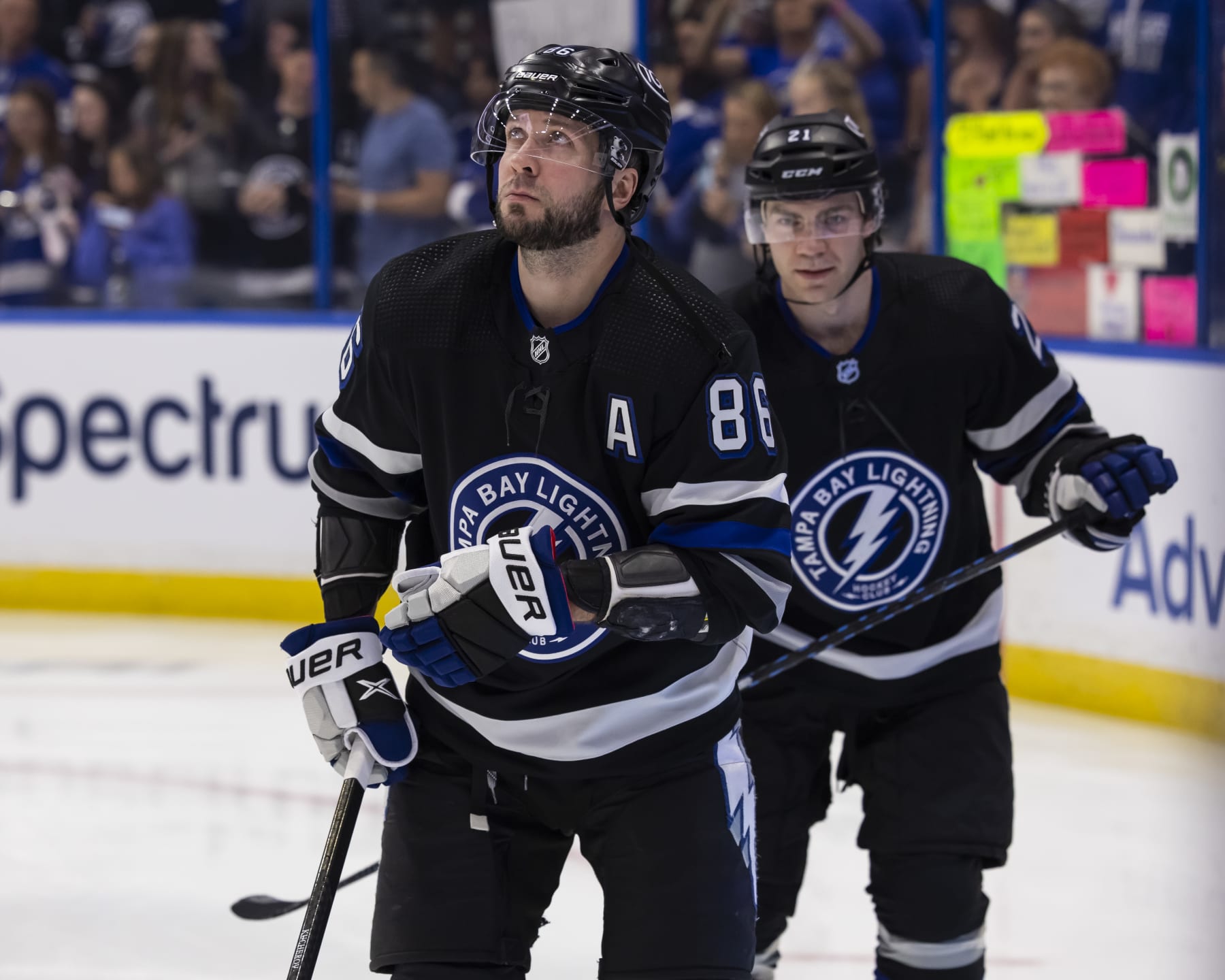
When the Tampa Bay Lightning debuted their latest black alternate jersey, we were left kind of unimpressed. We've seen them use black alternates in the past, and they've really not done anything all that great to elevate their look.
But the more we looked at the newest ones, the more different features stood out and made us appreciate them. They used the circular logo that is on the shoulders of their home and away set and put it front and center. Say what you will about the circular style logos, but sometimes they look good in the right context.
The details that grabbed us here, though, were the stripes along with the number font. You have to be either a longtime Lightning fan or a huge jersey nerd to appreciate that the drop shadow number style they used for this one was similar to what they used with their original uniforms in 1992-1993. That kind of a callback is one that speaks to us and made us really enjoy this latest alternate more than anything else they've worn.
Toronto Maple Leafs

The blue and white of the Toronto Maple Leafs, like the bleu, blanc, et rouge of the Canadiens is iconic and so is their jersey. And like the Canadiens, we're picking the Leafs home jersey as the best one.
Classics are nearly impossible to beat and the biggest fight here was between the home or road jersey. We love when the Leafs bust out the Toronto St. Pats jerseys for St. Patrick's Day and we loathe when they use their alternate black jerseys, so it makes this kind of discussion a lot easier to handle.
But picking between the blue or the white jersey is hard. They both look simple and perfect, and they both scream out boldly that they are the Toronto Maple Leafs But when it comes down to it, accept no substitutes or imitators, the home blues are where it's at.
Vancouver Canucks

Vancouver's uniform set is another one among the best in the NHL. Their home and road blue and white set look superb and the orca crashing through the letter "C" logo is one that's grown on us over time. We admit, we used to be big-time haters, but we've softened our stance on that.
But the biggest reason why we've stopped being so mean about the regular set is because they brought back the "flying skate" black, red, and yellow jersey from the 1990s as their alternate.
Seeing this beauty of a jersey gracing the ice in Vancouver again brings us back to the days of Pavel Bure, Trevor Linden and Kirk McLean, and we love them for it.
The 1994 Stanley Cup Final team was so exciting to watch and that they were in one of the best Finals of all time helps out with that.
Watching Quinn Hughes, J.T. Miller and Elias Pettersson tearing up the ice in them now is more than fitting for those glory days of the '90s.
Vegas Golden Knights

For as new as the Vegas Golden Knights are to the NHL, they've got a very conflicting uniform set. Their logo is great, but their original gray and white home and road set, while somewhat cool, was almost a little too busy.
Fortunately, they leaned into being from Las Vegas and busted out the gold jerseys that started as their alternates and quickly became their home set and instantly became their iconic look.
While we did enjoy their Winter Classic jersey from this year's game in Seattle, it was really hard to pass on the glittering gold (and yes, it does glitter) of their home jersey. Everything about it screams, "Vegas" from atop Caesar's Palace and there's no mistaking it when you see a fan wearing one along the Strip.
Seeing the Golden Knights lean into not just being golden but also being from Sin City helped tie it all together in the best way.
Washington Capitals

A harsh realization was made while deciding which Capitals jerseys was their best one from this season: None of them are overly good.
The Caps have two excellent logos. The wordmark-style logo that's the modern version of their original one and the "weagle" on the shoulder of their home and road set are superb icons. The branding in Washington is outstanding, do not mistake that.
But the jerseys themselves are holdovers from the Reebok era with all kinds of piping and color swatches and it's generally way too busy.
We long for the time when the Capitals broke out their 70s/80s/90s throwbacks with the stars on the sleeves and reminded us of Peter Bondra and Rod Langway. Even their Reverse Retros that brought back the "screaming eagles" were fun.
But these? We need a refresh. We don't need anything radical, just something not stuck in the mid-2000s. We picked the home red jerseys because its flaws don't stand out quite so much. We guess.
Winnipeg Jets

The Winnipeg Jets have a solid set of uniforms, and we've grown to like their latest sky-blue alternates that pay homage to the Canadian Air Force. But it's their WHA throwback-style jerseys that win the title every time.
The navy-blue color can be forgiven because this 1970s-style jersey brings back the Jets logo from the 1970s and 1980s right up front. Like most of the throwbacks, this style is simple and beautiful and gets us thinking about greats like Dale Hawerchuk and Randy Carlyle. It also helps that current Jets like Kyle Connor and Mark Scheifele and Connor Hellebuyck are helping make it their own as well.
We get it. It's not an overly original jersey, but it's great and that's all that matters for us.