


The Definitive MLB City Connect Jersey Power Rankings
May 31, 2024The Definitive MLB City Connect Jersey Power Rankings
Major League Baseball's City Connect program began in 2021, with the goal of introducing bold alternate uniforms for every MLB team aimed at attracting younger fans to the sport.
By the 2024 All-Star Break, every MLB team except the New York Yankees and Oakland Athletics will have a City Connect uniform. To this point, the Yankees have resisted getting one, while A's owner John Fisher has done a great job making sure his team doesn't have a city to connect to.
It's unclear what the future of the program is beyond 2024. Will this just be a short-lived experiment that produces a few uniforms that stand the test of time, or will MLB follow the NBA model of constantly introducing new themed alternate threads?
While we don't yet know what will become of the City Connect program after 2024, here's a ranking of all the designs that have been released.
Coming Soon to a Ballpark Near You

The Minnesota Twins are set to unveil their City Connect jerseys on June 10, before wearing them in game action for the first time on June 14. They've released this teaser.
Also, the Los Angeles Dodgers' first City Connects were universally disliked—more on that in a minute—so they will be getting new ones that are set to make their on-field debut on June 21. A concept for them has leaked.
Dodgers Nation @DodgersNationNothing has been officially announced but it looks like we may have a first look the City Connect uniform for the Dodgers.<br><br>What are your thoughts?<br><br>📸: <a href="https://twitter.com/DyeMyColor?ref_src=twsrc%5Etfw">@DyeMyColor</a> <a href="https://t.co/5qIfS1QdKq">pic.twitter.com/5qIfS1QdKq</a>
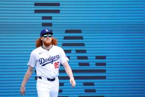
27. Los Angeles Dodgers (Design No. 1)

There were a few different iterations of the Dodgers' first City Connect uniform—which made its on-field debut in August of 2021—with the Blue tops that read "Los Dodgers" drawing negative reviews from pretty much everyone.
First, the Dodgers had a matching "Los Dodgers" cap. Then they switched to the classic "LA" logo on the front of the hat, keeping the black brim and shifting the "Los Dodgers" to the right side of the cap (which is the look seen above). Finally, the blue pants were abandoned in 2023 in favor of white ones, which weren't worse, but didn't look a whole lot better. In fact, they looked like something out of the Cactus League.
Blake @ByBlakeWilliamsThese are the <a href="https://twitter.com/hashtag/Dodgers?src=hash&ref_src=twsrc%5Etfw">#Dodgers</a> updated City Connect uniforms. Looks like the white pants with a blue stripe are the only change from last season when they had blue pants. <a href="https://t.co/2h9fWu7MlS">pic.twitter.com/2h9fWu7MlS</a>
The Dodgers retired these uniforms after the 2023 season, and will become the first team to unveil a second City Connect design in June. That suggests teams can decide after three years to ditch their City Connects if they aren't popular, although it's unclear if they will need to have a second design ready to do so.
26. Detroit Tigers
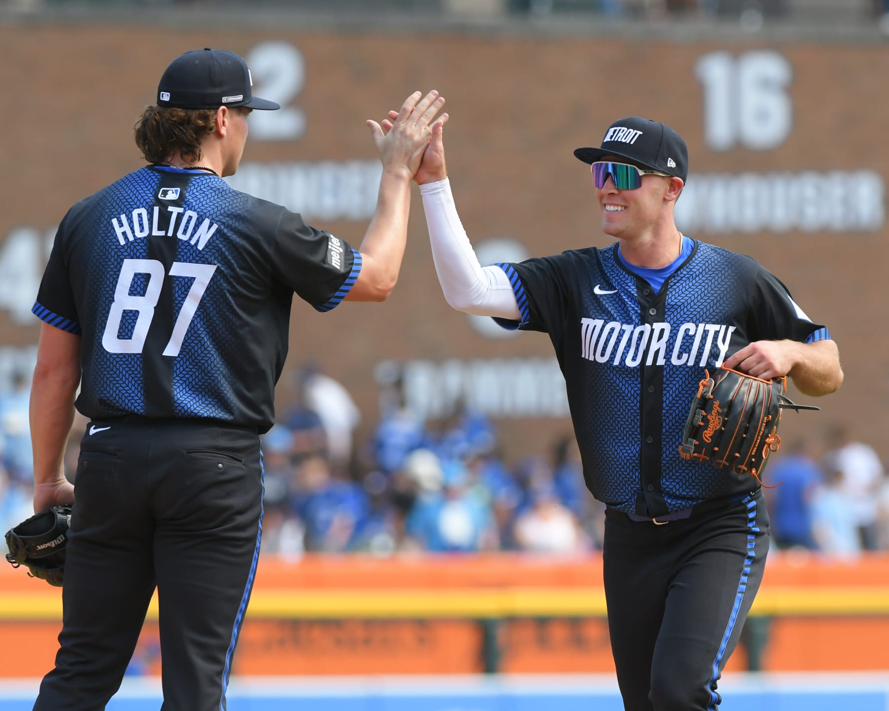
There was something sacred about the Tigers only having their home white and road gray uniforms. They could have chosen to be like the Yankees and passed on the City Connect program. Instead, they ruined tradition with a struggling-for-funds NASCAR team look.
Obviously, it's not difficult to understand where the tire theme came from for a team that represents "the Motor City." It is difficult to understand how anyone thought these looked good. Yes, abandoning the two-uniform tradition and the olde English D make these worse. But they're pretty bad even when you don't factor that in.
And yet, the worst part of the uniforms—which debuted in May of 2024—is definitely the hats. You are a team with an iconic logo, and named after one of the most ferocious animals. The best they could do was slapping "Detroit" across the cap in italics?
25. Milwaukee Brewers

People do really call them the "Brew Crew," but perhaps they didn't need a jersey that had that across the chest.
The Brewers did a tremendous uniform refresh prior to the 2020 season, bringing back the iconic ball-in-glove logo on a full-time basis and creating threads that felt like modern classics.
But Milwaukee watered down what is otherwise a very clean uniform set with these smurf colored alternates that debuted in June of 2022, and are now worn for all Friday home games.
SportsLogos.Net @sportslogosnetSome of the details of the new Milwaukee <a href="https://twitter.com/hashtag/Brewers?src=hash&ref_src=twsrc%5Etfw">#Brewers</a> "Brew Crew" City Connect uniform including a baseball grill on the right sleeve and a hybrid MKE 414 logo on the caps.<br><br>My full story here: <a href="https://t.co/KpKE5kGbu9">https://t.co/KpKE5kGbu9</a> <a href="https://t.co/nO6ucXz8Q4">pic.twitter.com/nO6ucXz8Q4</a>
For as great as the ball-in-glove logo is, the baseball grill sleeve patch is goofy and the MKE/414 cap logo—which combines the airport initials and area code—is an illegible disaster.
24. Texas Rangers

If these were a uniform that had been worn in the 1920s and were being brought back as a one-off throwback weekend, there may be some novelty. But considering they were released in April of 2023 and are now worn for all Friday games at Globe Life Park, there's much less appeal.
We would be remiss not to point out all the different easter eggs that were included in these threads.
But with all that acknowledged, the "TX" logo is super busy and could easily be confused for nine (IV) in roman numerals.
In evaluating this uniform, you also have to consider what was lost. The Rangers had to ditch one other uniform to add a City Connect because of Nike's "4+1" rule. Whatever you thought of the red alternate tops the Rangers shelved, they were much better than the busy logo and midnight navy pants that come with their City Connects.
23. Cincinnati Reds

The Reds could stand to upgrade their current threads, which came in at No. 29 on the B/R preseason rankings of all 30 MLB uniform sets. Adding these City Connects in May of 2023 didn't help their overall spot.
So many teams in sports now have black alternates, and an increasing amount feel unnecessary. These are no exception. 1) It's not practical to be wearing all-black uniforms for a sport played primarily outdoors in the summer. 2) The execution of these, with black writing on a black jersey, is just not very good.
Black has been a part of the Reds uniforms to varying degrees in their history, but more as a secondary color. And it probably should have remained that way.
And then there's the "C" on the cap, in the "infrared red" that's used as a secondary color on the uniforms. It kind of just looks like bacon shaped into the letter C.
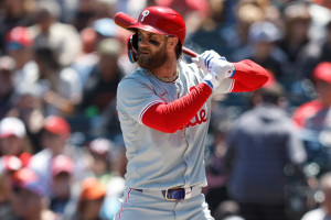
22. Philadelphia Phillies

The Phillies began play in 1883, and like many of the older franchises on this list, such drastic deviations from their primary threads feel jarring.
The gradient uniforms—introduced in April of 2024 and worn for all Friday home games— feature the colors of Philadelphia's flag, the only city flag that has never been changed. Across the chest "Philly" is written in a constitutional font with Liberty Bell cracks repeating inside the city's nickname.
Tim Kelly @TimKellySportsSome smaller details on the Phillies City Connect unis <br><br>- Skyline inside the Liberty Bell on the cap<br><br>-Liberty bell cracks inside the "Philly" script across the chest <br><br>- City of Brotherly Love patch on sleeve<a href="https://twitter.com/PhilliesNation?ref_src=twsrc%5Etfw">@PhilliesNation</a> <a href="https://twitter.com/UniWatch?ref_src=twsrc%5Etfw">@UniWatch</a> <a href="https://twitter.com/PhilHecken?ref_src=twsrc%5Etfw">@PhilHecken</a> <a href="https://t.co/NHwUl8muyD">pic.twitter.com/NHwUl8muyD</a>
The hats have caught on in Philadelphia, as they feature a Liberty Bell outline with the skyline of Philadelphia inside. The two yellow stars represent the stars normally above the i's in "Phillies" on the team's four other uniforms. They've sold, as have hoodies with the "LOVE" sign patch.
But overall, the font is really bad, and you just don't feel like you're watching the Phillies when you see these uniforms. The Phillies had to ditch their red alternate tops to comply with Nike's 4+1 rule, and while there were definitely legitimate critiques of those, they at least matched with the rest of the uniform set. They also gave the Phillies a road alternate, as opposed to their current rotation with four home uniforms and one road.
21. Pittsburgh Pirates

Black and yellow is a great color scheme, and it remains one of the coolest uniform-related notes in sports that all three major sports teams in Pittsburgh—the Pirates, Steelers and Penguins—use the duo of shades that Wiz Khalifa once rapped so eloquently about.
With that said, these uniforms stink. Beyond "PGH" being extremely uncreative, the Pirates went overboard with easter eggs on these jerseys, which you need a microscope to actually make out. The reality is that the tops look like yellow pinnies with "PGH" and a Nike swoosh on them.
The worst part about the Pirates' City Connects is unquestionably their two-toned batting helmets, which look like they were spray-painted in the parking lot of PNC Park before the game.
Pittsburgh Pirates @PiratesOfficial: <a href="https://twitter.com/hashtag/Pirates?src=hash&ref_src=twsrc%5Etfw">#Pirates</a> unveiled the NEW Sunday alternate unis for 2016! <br>We're throwing it back to 1979. <a href="https://twitter.com/hashtag/WeAreFamALee?src=hash&ref_src=twsrc%5Etfw">#WeAreFamALee</a> <a href="https://t.co/3lBTO467nL">pic.twitter.com/3lBTO467nL</a>
In the not-so-distant past, the Pirates wore their 1979 throwbacks (seen above) on Sunday home games. They utilized a similar color scheme, but were rooted in the team's history and had a pillbox cap, which is lightyears better than the PGH hat. If they wanted to go with a gold top and black pants—which, admittedly, is a bold look that won't please everyone—it should have been based on those.
20. Chicago Cubs

You know what doesn't look good? Navy blue tops with navy blue pants. But that's what the Cubs went with for their City Connect uniforms, which were first introduced in June of 2021. Baby blue is featured as a complimentary color throughout the uniforms, and on the brim of the cap.
Wrigley Field is obviously one of the most iconic stadiums in the history of professional sports, which is why it ranked in the top five in the B/R MLB stadium rankings heading into the season. But did the Cubs need a jersey that says "Wrigleyville" across the chest? Nope.
SportsLogos.Net @sportslogosnetThe new <a href="https://twitter.com/hashtag/Cubs?src=hash&ref_src=twsrc%5Etfw">#Cubs</a> City Connect caps feature a re-coloured Cubbies logo on a navy blue crown with light blue visor. One of the red six-pointed stars from the Chicago city flag is included inside the logo.<br><br>Full Story: <a href="https://t.co/fXFcqB84sV">https://t.co/fXFcqB84sV</a> <a href="https://t.co/M1rwmtVg8e">pic.twitter.com/M1rwmtVg8e</a>
The Cubs did keep their "C" rather than writing "CHI" or something lazy on the cap. However, between the "C" being white with baby blue trim, and the red star that people outside of Chicago don't really know comes from their flag, this doesn't feel like a Cubs cap. It's not necessarily a bad cap, but you don't see it and immediately know it's a Cubs hat. Maybe that's what the goal of the City Connect program was, but with some of these historical franchises, putting them in unrecognizable gear is a tougher sell.
These aren't offensive like some of the others below them, but while they have less detractors than the polarizing uniforms a few spots lower, they also probably have less proponents.
19. San Francisco Giants

The idea of fog obscuring the Golden Gate Bridge would have been a cool fan-fiction created jersey if shared on Twitter, but the reality of it feels not worthy of a team that otherwise has a great uniform mix.
That's not to say there's nothing redeeming here. The Fanta colored hats are cool, although the Golden Gate Bridge on the right side is overkill. To be fair, the batting helmets are fun, even if they are softballish.
Probably the worst part of the jersey is the "G" on the left side of the chest. The "SF" logo is one of the best in baseball, and would have worked fine there and they could have made it match with the cap.
The way we look back at the Seattle Mariners "Turn Ahead The Clock" jerseys now—a fun concept, even if they're also kind of ridiculous for an MLB team to be wearing—might be how the Giants' City Connect uniforms look in 25 years.
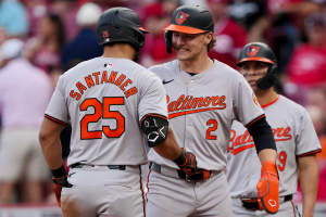
18. Baltimore Orioles
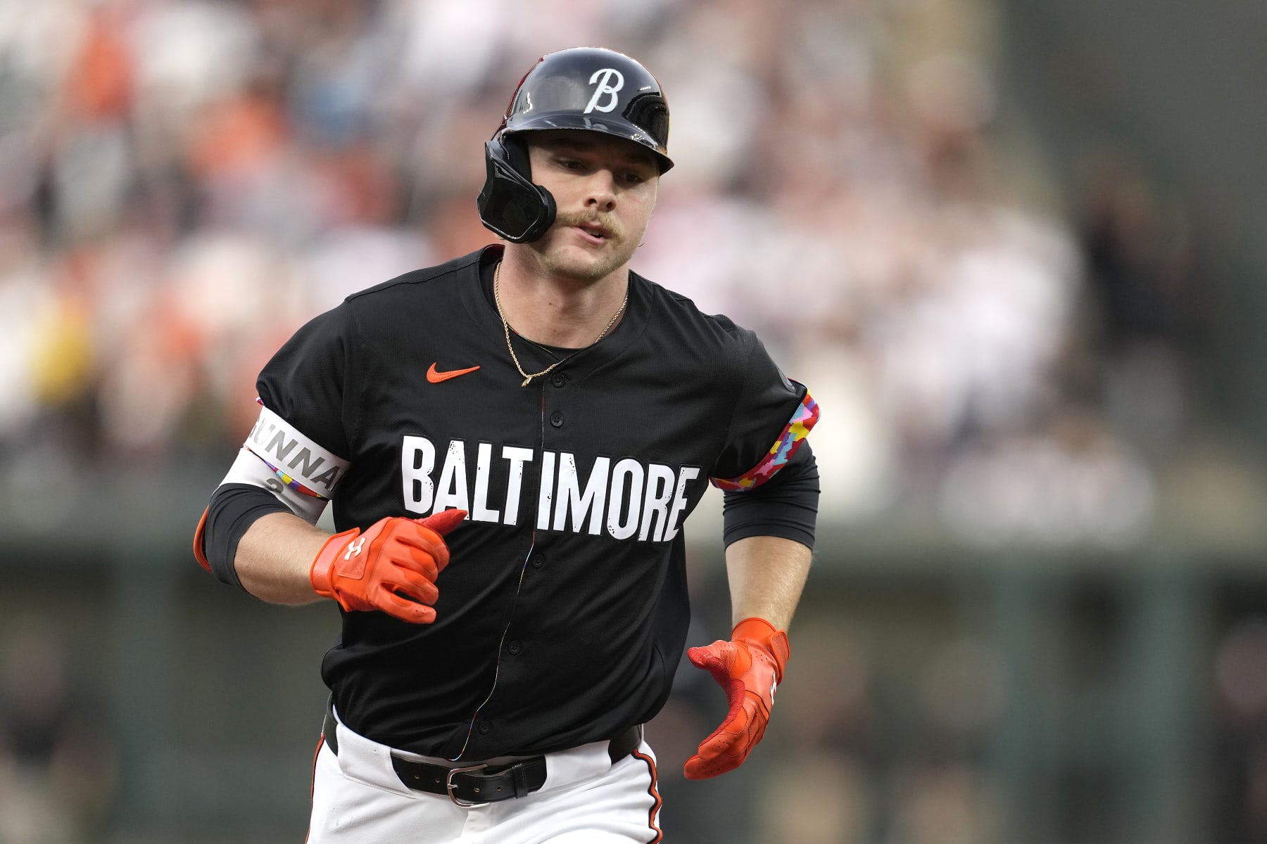
In May of 2023, the Orioles introduced their City Connect uniforms, and really missed an opportunity to add a strong fifth uniform to an otherwise excellent set.
Courtesy of MLB.com's Jake Rill, here's an explanation of the mindset the Orioles and Nike had when creating these uniforms, which are worn for Friday games at Camden Yards.
"It was designed on the inside—a first for an MLB team—as a showcase of the city's colorful interior, a contrast from the grayscale exterior that represents a "surface-level view" that some may have of the city," the article said. "Those vibrant colors symbolize the uniqueness of the various aspects of Baltimore."
OK, but like, what everyone sees is the outside of the jersey. And even though the Orioles have since made the correction of replacing the matching black pants with white pants, the overall uniform is pretty dull. It reads "Baltimore" across the chest in white writing over top of a black jersey. The cap has a cursive "B".
It's great to pay homage to the city you play in, but Maryland has a great state flag and the Orioles have some of the most unique logos in MLB history. How were none of those incorporated into this?
A final thought: As noted with the Reds, black jerseys aren't necessarily practical for a team that plays outdoors in the summer. But the Orioles now have two black alternates that they mix in at Camden Yards, and these are clearly inferior to the black tops that read "Orioles" across the chest in cursive orange writing.
17. Kansas City Royals

The Royals City Connect uniforms have a very similar color scheme to that of the Cubs, but they made the correct decision in just going with white pants as opposed to navy blue ones. Their concept is also more interesting, even if the execution leaves something to be desired.
In April 2022, the Royals unveiled their City Connect uniforms, which pay homage to not only the fountains at Kauffman Stadium, but also one that exists all around "the City of Fountains."
It can be debated how good the waterfall effect on the "KC" logo featured on the cap and left side of the chest looks, but you at least appreciate what the vision was here.
Matthew Drake @MJD7DesignKansas City Royals City Connect:<br><br>Navy felt like an odd choice for the Royals to me, so I went with their classic royal blue, while adjusting the stripes & number font to match the logo even more closely. <a href="https://t.co/IvZzDoGAli">pic.twitter.com/IvZzDoGAli</a>
But while the Royals don't necessarily need another royal blue jersey, this fan mock-up is much more appealing than the actual City Connects, which lean largely on navy blue.
16. Toronto Blue Jays

Admittedly, these are the newest City Connect uniforms ranked, so there hasn't been proper time to really sink into these, even if they were leaked a few days before their May 30 unveiling and May 31st on-field review. With that, it's possible for opinions to change in the future.
The first take on these: They feel a bit like a fan creation, but they are kind of fun. They keep the Blue Jays' excellent script font, with the idea being that they represent the skyline at night in Toronto. And hey, it's hard to mess up a hat that features a Maple Leaf.
These feel a bit like another "fun, even if not great" alternate jersey in the sports: the boathouse row City Edition uniforms the Philadelphia 76ers wore in 2020-21.
Overall, while the Blue Jays didn't need another uniform in their strong set, these don't drag the kit down.
15. New York Mets

The Mets released their gray and purple City Connect uniforms in April of 2024, and now wear them for all Saturday games played at Citi Field.
MLB.com's Anthony DiComo explained why these were the two colors picked.
"They're about to add two more colors into the regular rotation: gray for the concrete jungle of New York City, purple for the 7 Line that runs to Citi Field," DiComo wrote.
Perhaps gray would have been a more fitting color for a road alternate, but these are still good tops. Yes, another team in New York is allowed to have pinstripes other than the Yankees, as the Mets primary home uniforms also feature pinstripes. The Mets also managed to find the right amount of purple as a secondary color, while not making the mistake of going with gray or black pants.
The Queensboro Bridge being across both the cap and helmet feels a bit like something you would see at Lids in 2009, as opposed to on-field MLB apparel. But the Mets kept their primary logo on the gray caps, which match the tops.
Even if you aren't a huge fan of these, they aren't offensive in the same way that some of the other City Connects have been.
14. St. Louis Cardinals

One of the final City Connect uniforms unveiled, the Cardinals released these red tops in May of 2024, marking the first time the franchise has ever worn that color jersey during the regular season.
Overall, the jerseys are really strong. The perched Cardinals are iconic, and soften the blow of going with a nickname across the front like "the Lou." The Cardinals say that St. Louis rapper Nelly popularized the nickname for the city, and even if it wasn't intended, it also kind of comes off as a nod to Lou Brock, the franchise's all-time leader in stolen bases.
The left sleeve also features a cool patch that combines the St. Louis arch and Fleur-de-Lis:
While many teams have unsuccessfully tried to create red alternate tops, the Cardinals did a very good job here of respecting their classic uniforms and trying to appeal to a younger audience.
What weighs these down is that the "STL" cap is abysmal. There's absolutely no reason that the Cardinals couldn't have worn their primary hats with the intertwined "STL," other than trying to get fans to buy another piece of merchandise.
13. Boston Red Sox

The Red Sox kicked off the City Connect program in April of 2021, unleashing these Boston Marathon-inspired uniforms, which they wear for all Saturday home games and the entirety of Patriots' Day Weekend.
The yellow and blue is a deviation, obviously, from the color scheme the Red Sox are associated with. But they keep their classic "B" logo on the cap and batting helmet, while embracing a color scheme that's pretty easy to explain the origin of to those that aren't from Boston.
Also on the left sleeve is the 617 area code. Generally speaking, area codes come off as lazy in this program. But taking the area code and turning it into a racing bib really fits the whole theme.
Boston Globe Sports @BGlobeSportsThe Red Sox will wear yellow jerseys with blue letters on April 18 and 19 to celebrate Patriots Day in Boston as part of Nike's new "City Connect" series. The arm patch features Boston's 617 area code. Read more: <a href="https://t.co/V3k9hN82vr">https://t.co/V3k9hN82vr</a> <a href="https://t.co/GLX6SDYKdj">pic.twitter.com/GLX6SDYKdj</a>
Ultimately, the "Boston" script isn't great, and yellow isn't for everyone. But the Red Sox came up with a theme that really fits their city and leaned all the way into it. Good for them.
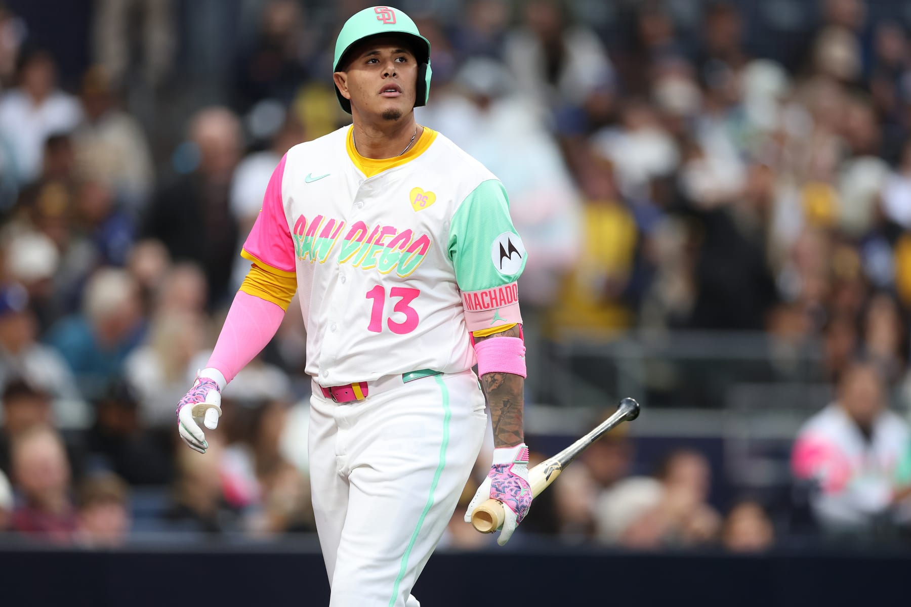
12. San Diego Padres

Perhaps the most polarizing City Connect uniforms, the Padres pushed all their chips to the center of the table with pink and mint threads that are "meant to match the vibrant colors of San Diego's fabled pink and yellow sunsets beyond the Pacific Ocean."
The Padres made the wise decision to keep their "SD" logo on the mint caps and batting helmets, rather than creating a lazy "San Diego" cap. Also still on the sleeve is their Friar logo, which certainly looks interesting in this color scheme.
The "San Diego" script has a very 80s feel to it. On such a busy uniform, the script probably should have just been mint, considering the number right below it is pink. Additionally, the Padres probably should have excluded yellow from this uniform, as mint and pink are bold enough on their own.
Tim Kelly @TimKellySportsFernando Tatis Jr. added a lot of pine tar to the Padres' City Connect batting helmets, and now it looks like Shrek's skin. <a href="https://twitter.com/UniWatch?ref_src=twsrc%5Etfw">@UniWatch</a> <a href="https://twitter.com/PhilHecken?ref_src=twsrc%5Etfw">@PhilHecken</a> <a href="https://t.co/gDNeu6jBSj">pic.twitter.com/gDNeu6jBSj</a>
One super specific complaint is that right fielder Fernando Tatis Jr. needs to stop slopping pine tar on his City Connect batting helmet. It makes the helmet go from looking mint green to looking Shrek green.
Overall, this probably makes more sense as an NBA jersey than an MLB one, and it does kind of resemble the "Miami Vice" scheme that the Miami Heat have created multiple different alternates of. But the City Connect program has produced so many teams just creating some combination of black or navy blue with no contrast. At least the Padres shot their shot.
11. Tampa Bay Rays

Upon their release, the Rays got a great reception for their City Connect uniforms. But like many on this list, it's important to separate City Connect merchandise from the actual uniforms.
Unveiled in April of 2024, the Rays City Connect uniforms have a tremendous black cap with a purple brim that features "a Ray combined with the Sunshine Skyway, the bridge that connects Pinella's County to Manatee County." If you've ever been to Tampa Bay, driving over the Sunshine Skyway Bridge is an awesome experience, so the hat gets an A-plus grade.
The City Connect reveal also came with some other popular secondary logos, primarily the skateboarding Ray:
SportsLogos.Net @sportslogosnetSome truly epic logos coming out of this Tampa Bay Rays City Connect release, the entire set is inspired mostly by the Tampa Bay Area's role in skateboarding culture with local elements rolled in, Sunshine Skyway Bridge, the St Pete pelican.<br><br>My story: <a href="https://t.co/e98UG2TcLF">https://t.co/e98UG2TcLF</a> <a href="https://t.co/ngKtt4RRye">pic.twitter.com/ngKtt4RRye</a>
However, are we going to pretend that the "Tampa Bay" logo in flames doesn't look like a cheap shirt that a 10-year-old would buy at Kmart in 2005? And hey, this program was designed to primarily appeal to younger fans, but the flaming Tampa Bay script undoes a lot of the good will created by the hat.
Additionally, the charcoal texture of the uniforms isn't aesthetically pleasing, even if the theme of these "Grit and Glow" uniforms was to be edgy and come off as outsiders.
It's hard to rank this any lower, because they got a really strong reception upon their release. But the more you focus on the actual uniforms, as opposed to the merchandise, the less excited you are.
10. Houston Astros

In April of 2022, the Astros introduced their "Space City" alternate threads as part of the City Connect program, giving them a new Monday alternate uniform.
This is one where individual items that make up the full uniform set are really cool. The cap features the primary logo of the Astros, but "launches planetary tracks and rainbow gradient."
Throughout the uniform—from the piping to the custom socks worn with the look—the vintage rainbow look is paid homage to. The Astros wore their "Tequila Sunrise" uniforms on a regular basis from 1975-1986, and while there might have been a temptation to just recreate those, it's cool that they paid homage to them in the City Connects.
Ultimately, though, while this is a cool hat and a cool jersey if you just are a fan wearing one of them, the full uniform set being all navy blue is disappointing. First of all, the Astros already have navy blue home alternate tops that pay homage to the rainbow tops themselves. Secondly, if the idea was to make the full uniform look something like an astronaut suit, why was navy blue picked as the primary uniform color, as opposed to some shade of white?
There's little doubt that the Astros have sold a ton of City Connect gear, and probably done very well in attracting younger consumers who may not otherwise be interested in baseball. So it's hard to tear down these alternates. But the full uniform set is just too navy blue reliant.
9. Seattle Mariners

The Mariners already had a great uniform set, and they actually ditched their road grays altogether prior to the 2023 season to comply with Nike's "4+1" rule. While the grays were really good road jerseys, Seattle replaced them with one of the cooler City Connect uniforms.
Beginning on May 5, 2023, the Mariners have worn these City Connect uniforms for Friday games at T-Mobile Park. They draw inspiration from Seattle baseball history.
"Seattle is stitched across the chest of the rush blue jersey, with the lettering style evocative of the Seattle Pilots jerseys," the team said upon the official release of the threads. "There's a black drop shadow on 'Seattle,' which pays homage to a similar drop shadow used by the 1955 Pacific Coast League Champion Rainiers."
Also back with these uniforms is the Mariners trident logo, which was their primary image from their inception in 1977 through 1986. It's on a "rush blue" cap which features a black brim. Both the cap and matching jerseys—often worn with black sleeves underneath—are great one-off items for fans.
Are the black pants a little much? Maybe, although "rush blue" pants probably would have been overkill. And no one wanted to see yellow pants, which would have matched the "Seattle" script across the chest and the trident Mariners logo on the cap.
8. Atlanta Braves

On one hand, the Braves City Connect uniforms have a tremendous color scheme, which pays homage to their primary home uniforms worn from 1972-1975.
The problem is it's not like the lowercase "a" throwbacks were one that history forgot about. Henry Aaron broke MLB's home run record by hitting his 715 career blast while wearing them on April 8, 1974, a highlight that's constantly replayed. Atlanta also wore the original iteration of these jerseys as a throwback as recently as the 2022 season.
So when the Braves introduced their City Connect uniforms in April of 2023—which replace the lowercase "a" with the current "A" and ditch the "Braves" script across the chest for "The A" on the left side of the chest—it was impossible to disassociate them from what they were inspired by.
Tim Kelly @TimKellySportsThe Braves City Connect uniforms look like a knock-off that would be sold by an unlicensed vendor outside of the stadium when compared to the originals. <a href="https://twitter.com/UniWatch?ref_src=twsrc%5Etfw">@UniWatch</a> <a href="https://twitter.com/PhilHecken?ref_src=twsrc%5Etfw">@PhilHecken</a> <br><br>(Getty Images) <a href="https://t.co/4x8iTzOVzk">pic.twitter.com/4x8iTzOVzk</a>
Overall, these are sharp uniforms. But the originals were even better, and because they were so fresh in everyone's memories, it was an underwhelming release.
7. Cleveland Guardians

These hardly got the most acclaim of any City Connect uniform upon release, but when you consider the Guardians ranked dead-last on the B/R preseason uniform countdown, these may be the best uniforms in their set.
While the stripes down the sleeves do pay homage to what we'll call "The Major League Era" in Cleveland, these represent the first uniforms where it really feels like they are turning the page and fully embracing being the Guardians now.
Cleveland made the decision to ditch their previous nickname in 2022, but kept virtually the same colors, hats and uniforms. These may not be a new color scheme, but the texture of the "CLE" on the front of the uniforms leans all the way into the traffic statues that inspired the new nickname.
SportsLogos.Net @sportslogosnetThe Cleveland Guardians City Connect uniform features "CLE" across the chest in a style that incorporates the styles and colours of the Guardians of Traffic statues.<br><br>More on their new City Connect uniforms here: <a href="https://t.co/Yc6PkmpIe5">https://t.co/Yc6PkmpIe5</a> <a href="https://t.co/IACN3879tF">pic.twitter.com/IACN3879tF</a>
The sandstone color used for the front of the cap, "CLE" script and the pants is a really good color, and MLB.com's Mandy Bell says the shade "is influenced by the Berea sandstone from which the bridge pillars were carved more than 90 years ago." Perhaps it should be used across more uniforms than just this one.
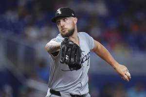
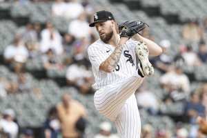
6. Chicago White Sox

One of the first City Connects unveiled, the White Sox City Connect uniforms have been one of the most popular in the series since making their on-field debut in June of 2021.
The threads are black-on-black, but mix in some dark gray on the black, along with white pinstripes. Jerseys with city nicknames across the front can often feel gimmicky, but the "Southside" script works well, particularly because the "S" in it looks similar to the one used in their iconic "Sox" logo.
Speaking of which, the only real criticism to be made of these uniforms is that the "CHI" hats are uncreative, and fall into the category of looking like something that would be sold at an airport gifts hop. The White Sox would be wise to just wear their primary black "Sox" caps with the City Connect uniforms. The uniforms are already unique enough without needing a different hat.
5. Arizona Diamondbacks

Even if it's frustrating that the Diamondbacks won't just return to purple and teal on a full-time basis, the uniform refresh that they did prior to the 2024 season generally received really good marks. When you add in the City Connect uniforms that were introduced in June of 2021, the Snakes have a pretty good overall kit.
Worn for Tuesday games played at Chase Field, the City Connect uniforms read "Serpentines"—which means snakes in Spanish—across the chest to "pay tribute to the Hispanic culture so prominent in Arizona." The color of the jerseys and pants is designed to "emphasize the Sonoran sand color," according to MLB.com's Steve Gilbert.
The Diamondbacks were smart not to get too far in the weeds with their City Connect uniforms. They kept their primary "A" cap logo, just adjusting it to fit the color scheme of these alternate uniforms.
If there was one request to make of the Diamondbacks, it would be to make it mandatory to have all players wear snakeskin belts with the City Connects like Zac Gallen.
4. Los Angeles Angels

The Angels haven't managed to do much right during Mike Trout's career, but the City Connect uniforms that they introduced in June of 2022 are one of the few strokes of genius from the organization in recent years.
While it's some combination of hilarious and sad to see some of the players the Angels had take part of the City Connect promos along with Trout just two years ago, there's little doubt that the surfboard theme fits perfectly for a team in Southern California.
Another cool feature—courtesy of MLB.com's Rhett Bollinger—is that the "S" in Angels "ends in the shape of a fish tail of a surfboard to honor Angels legends Trout and Tim Salmon."
What makes these uniforms so good is that you don't need to know about all of the hidden gems in the threads to appreciate them, because they are just good looking. But if you do know the extra details, it only further strengthens how sharp they look.
3. Colorado Rockies

When the Rockies first introduced their Colorado license plate-inspired City Connect uniforms in June 2022, they had matching green pants, which were perhaps a bit too much.
However, the Rockies have since adjusted the look to include white pants, which look much better and allow what's a very loud jersey to pop without feeling like overkill. The tops have a lot of 1990s Utah Jazz energy, which is hardly a bad uniform to be inspired by.
What's also impressive about this uniform set is that while it deviates from the Rockies typically purple and black color scheme, it still managed to keep the former shade involved. The pants feature a purple stripe down the side, while the mountains inside an excellent cap are purple.
2. Washington Nationals

The Nationals nailed these, managing to find a shade of gray that works for a home uniform, with cream font, cream pants and the cherry blossoms that are so synonymous with D.C. in the spring.
Introduced in April of 2022, the Nationals wear these threads for both Friday and Saturday home games. Realistically, they could probably be worn on the road too, although the pant color might need to be adjusted because most teams were white or cream at home.
The only criticism to be made of the Nationals here is that MLB.com's Jessica Camerato reported before the season that these will be retired after the 2024 season. Maybe that means a new design will be here in 2025, but it will be almost impossible to top these. Perhaps if there's enough public pressure, the Nationals will keep their popular City Connect uniforms in the rotation permanently.
1. Miami Marlins

The National League really didn't need another team wearing red, but the Marlins did such a great job on their City Connects that an exception will be made for the Fish.
While you typically associate the Marlins with teal, these uniforms do feel very much like they connect with the city of Miami. Specifically, these make sense for a team whose home ballpark is in Little Havana, because they were inspired by the Cuban Sugar Kings.
For all the teams who just slapped an area code on their sleeves or spoke of trying to embrace the future or pay homage to the past, the story of the inspiration behind the Marlins' City Connect uniforms is actually a really good one.
"The Sugar Kings (1954-60) took the field each day with the dream of becoming the first MLB franchise outside the United States," the Marlins said in a press release. "With the Marlins City Connect uniform, the Sugar Kings have finally arrived in the Major Leagues."
Pictured above, the batting helmets—which feature "MM" in a king's crown and a blend of "legacy red" and "Miami blue"—are by far the best ones that the City Connect program has produced.