B/R Staff: The Worst NBA Jerseys in Recent Memory
October 2, 2024B/R Staff: The Worst NBA Jerseys in Recent Memory

The recent release of the NBA's 2024-25 city edition jerseys featured some genuine doozies. And it got us thinking: What are the worst NBA jerseys in recent memory?
The league has featured plenty of iconic, sharp and original kits over the years, but there are some design failures, too.
From the unfortunate sleeved era to a bizarre mismatching of shorts and jersey—to a uniform that looked more like office supplies than basketball gear—you'll find some of the worst below.
Atlanta Hawks: 2016-17 Alternates

With all due respect: What the hell, Atlanta Hawks?
The concept of mismatched jerseys is pretty cool. And I respect franchises and designers actually willing to take chances. Too many jersey rebrands are just nods to what's already been (which can be fun!) or far too conservative (bleck.)
But these unis coalesce into a special kind of eyesore. They aren't so much innovative risk-taking as a collision of blahness. The most eye-popping aspect of them is the fonts on "ATL" and the numbers. They are far from plain yet decidedly visible. Good stuff.
It's oddly tough to explain what's so displeasing here. Maybe it's the color scheme. Black on red, with yellow mixed in, is aesthetic carnage when there are no unique transitions or aligning patterns tying them together. A dusty gradient would have done better on the jerseys themselves than those transparent triangles.
And please, for the love of everything, fire the brim of the shorts all the way into the sun. Are we playing basketball or getting ready for an amateur backyard boxing match?
—Dan Favale
Dallas Mavericks: 2019-20 City Edition

Dallas-based designer and artist Tex Moton is a pioneer in the city's street art scene. He's also, unfortunately, responsible for this monstrosity.
The Mavericks might deserve more of the blame, though. While teaming with Moton to create a jersey sounds like a cool concept, the result had Dallas looking like it had gone way too far trying to look cool.
Maybe it's fitting that Dallas rocked these during the 2019-20 season, the first campaign in which it got a firsthand view of the Kristaps Porziņģis-Luka Dončić combo. That sounded like a decent idea, too, and it also couldn't come together.
This uniform looks like an NBA2K custom uniform gone wrong. The graffiti font just doesn't land, and it's not helped by the fact that the team name features three different colors: white letters with black shading, all outlined in green. Maybe that could've worked if it was carried over to the number, but the number didn't have the font or the shading, so it almost felt like two different jerseys.
In general, the color schemes of "action green" and "coastal blue" failed to land. The combo was a big swing, but Dallas didn't fully embrace it, as the blue shifted to a darker navy the further down the uniform it went. It's like the Mavericks wanted to stand out but weren't totally comfortable doing it, so they only went halfway.
The whole thing felt a bit forced, like the franchise wanted to convince us it was cool but hadn't yet convinced itself.
—Zach Buckley
Orlando Magic: 2019-20 City Edition

The Orlando Magic's iconic colors, since the team joined the league in 1989, are blue, silver and black. From the Shaquille O'Neal era to Dwight Howard to the current playoff squad, the franchise has varied their look, but they're still clearly the Magic.
The Magic 2019-20 City Edition was fluorescent orange and black. Why?
The jersey wasn't nice enough to sell fans on the jarring color shakeup. It didn't look right.
It is one of the uglier missteps for a team that typically has a very defined, classic, standard look.
—Eric Pincus
Golden State Warriors: 2020-21 City Edition

Nostalgia is comforting and, if you want to get deeper about it by citing the entertainment industry's crippling addiction to established IP, sells pretty well. But sometimes the past is best left alone and unacknowledged.
As proof, consider the Golden State Warriors' 2020-21 City Edition jerseys. Believe it or not, these monstrosities are only a pale shadow of the hideous originals that debuted in 1997. Toned down a touch and missing the preposterously ugly lightning-bolt theme, the 2020-21 versions still feature the nausea-inducing yellow-orange-blue color scheme nobody asked for.
It was a mistake when the Warriors determined in 1997 that they needed to deviate from their gorgeous blue-and-gold Run-TMC color scheme, but at least that initial gaffe could be explained away as an effort to freshen things up amid a whole lot of losing. But to dredge up that old atrocious look in the midst of massive team success simply defied explanation.
In fairness, these throwbacks pay homage to Oakland and the 2007 "We Believe" run that provided the only pleasant fan experience in a two-decade span of bleak futility. But there are other ways to honor the past. These jerseys should never see the light of day again.
—Grant Hughes
Utah Jazz: 2022-23 'Highlighter Yellow'

For all of the organization's history in the mountain west, Utah Jazz jerseys featured a nod to the region or the name of the team it adopted from New Orleans.
The jazz note was an iconic logo donned by Pete Maravich (during the team's first season in Utah), Adrian Dantley, Karl Malone and John Stockton. Later, Malone and Stockton took the team to back-to-back Finals appearances in purple, white and blue jerseys that prominently featured the state's mountain peaks. More recently, Donovan Mitchell and Rudy Gobert rocked the red, orange and black gradient look that spotlighted southern Utah's red rock region.
So, when the organization rebranded to the bland, minimalist, black, white and highlighter yellow look it started in 2022-23, it came as sort of a shock to the fanbase.
That was especially true after the new look leaked prior to the reveal, as the fans digitally revolted and the team scrambled to bill the rebrand with a "purple is back!" motto that only applied to one of their four new jerseys.
Fortunately, the ill-fated experiment is nearly, mercifully over. Utah is going with a more modern approach to the 90s mountain jerseys starting in 2025-26. But we'll never forget their dalliance with the Eastbay, AAU-looking jerseys that accompanied the start of this rebuild.
—Andy Bailey
Miami Heat: 2023-24 'Heat Culture'

Nike has given us a lot of truly dreadful City Edition jerseys since it took over starting in 2017-18, but the Miami Heat were generally among the teams that got it right. Their pink and blue "Miami Vice" jerseys are among the best in modern NBA history.
But the nod to "Heat Culture" in 2023-24 was a massive misstep (especially in concert with the overly busy court that featured a small essay in the paint).
Whether it and its effects are real or not, advertising Heat culture on the jerseys just came off as corny. The more traditional Heat logo above the word "Culture" is too small (or maybe "Culture" is too big). The mismatched fonts don't work. They just clash, and not in a fun way.
And unfortunately, it doesn't look like the reaction to these kits has scared Miami off. The Heat are bringing them back in what might be an even more obnoxious red version in 2024-25.
—Andy Bailey
Charlotte Hornets: 2023-24 City Edition

What's the best way to address the unfortunate Charlotte Hornets City Edition jersey for the 2023-24 season?
First of all, the team's general abbreviation is "CHA," so for outsiders who weren't aware, the local airport has the "CLT" abbreviation. Then, the marketing featured star LaMelo Ball, who wears No. 1. The combination of letters, words and his number led folks to give the jerseys an unfortunate nickname.
You'll have to read between the lines here. The jersey itself was OK—nothing special and not particularly awful.
This was a branding/marketing issue.
—Eric Pincus
Los Angeles Lakers: 2023-24 City Edition

There is an alternate universe in which these jerseys go so damn hard. In that reality, the letters are more haphazardly, chaotically placed, and the font is more custom, maybe featuring some curves and drips, rather than something pulled from the stock block of Microsoft Word 1997.
Instead, we have…these.
The character placement is a major swing and miss. It isn't so much pleasantly chaotic as it is a triangle trying to be a preschooler's sketch of a house made up of letters on an escalator.
And like, why not at least commit to the bit? "Los Angeles" is in this weirdly not-weird-enough shape but "Lakers" is just perfectly aligned at the bottom. (Yes, I'm aware this is a nod to the 1960s iteration. That doesn't make it nicer.)
I'm almost impressed at how this jersey simultaneously feels too busy and like it doesn't have enough going on. The front could be streamlined—do we really need the entire team name?—in service of gussying up the oblique panels: stripes, waves, gradients, anyfreakingthing. These joints somehow look worse on the single-digit jerseys. Double digits might just distract from the awkwardly placed army of unimaginative lettering. A revised version in which the "Los Angeles Lakers" text circles the number might actually look pretty cool.
—Dan Favale
Anything with Sleeves
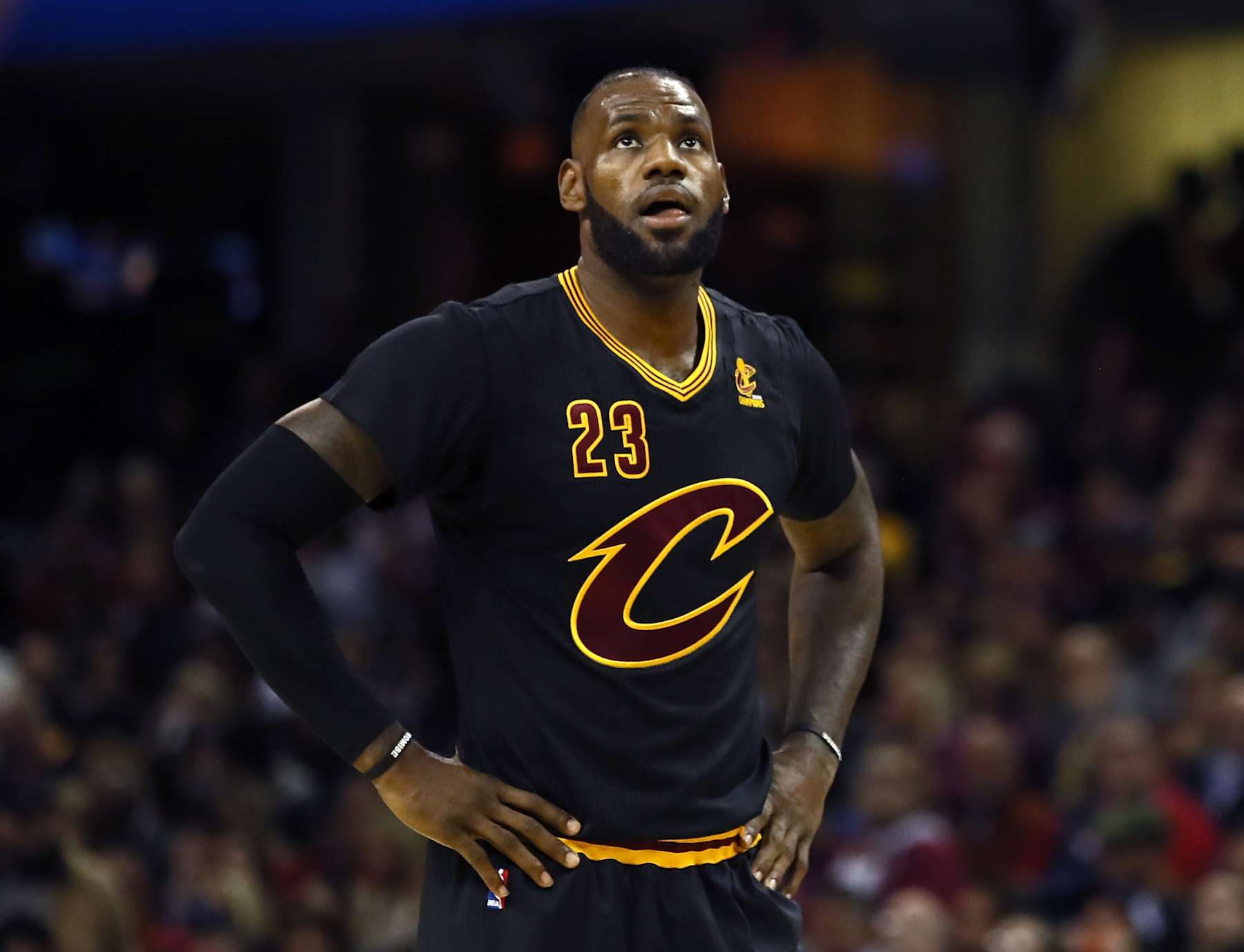
The NBA deserves credit for constantly trying to innovate and increase revenue streams in a sports landscape that changes constantly, but it went too far when it debuted sleeved jerseys during the 2012-13 season.
Everybody hated them from the jump, with player sentiment hitting its nadir during the Christmas games of 2013. Those special edition looks added cartoonish, oversized logos to a design that was pretty much universally reviled without what appeared to be gaudy, stick-on graphics covering the chest.
LeBron James seemed to put the final nail in the coffin when he ripped his sleeves off in the middle of a nationally televised game against the Knicks in 2015, but his Cavs would go on to win the 2016 championship in the same sleeved jersey he tore up in frustration.
Fortunately for all of our eyes, the fashion nightmare ended in 2017. But we're not getting those four years back.
It's never a great idea to just lean on tradition and reject any new idea out of hand, but the NBA violated the "if it ain't broke, don't fix it" maxim when it added sleeves to a perfectly functional and stylish tank design that had worked just fine for decades.
—Grant Hughes